
Live in Color: The Psychology Behind Beautiful Interiors
Chosen theme: Color Psychology in Interior Design. Discover how hues steer mood, focus, appetite, and connection at home. Join our community for palettes, experiments, and stories that make every room feel intentional—and unmistakably yours.
How Color Shapes Your Day at Home
01
Morning Energy: Sunshine Yellows and Tender Oranges
In color psychology for interiors, yellow and soft orange cue optimism and sociability. One reader painted only the inside of open shelves lemon, and breakfast conversations brightened without overwhelming the small kitchen. Try a citrus tea towel or art print this week.
02
Evening Calm: Blues and Greens that Breathe
Soft blues and desaturated greens are linked with lower arousal, encouraging deep breathing and slower evenings. A renter swapped a cobalt sofa throw for muted seafoam, and screen time dropped naturally. Share your calming swap, and tag our newsletter thread.
03
Balance with Neutrals: The Quiet Power of Gray, Greige, and Off-White
Neutrals are not blank; they are the rhythm section in interior color psychology. Use warm off-white to soften north light, or greige to bridge clashing woods. Post your wall sample lineup and ask the community for honest, light-specific feedback.
Room-by-Room Color Strategies
Conversation thrives where the palette feels welcoming. Amber lamplight and coral cushions subtly raise sociability, making lingering natural. A family reported fewer phones at night after layering warm textiles. Try a single coral pillow and tell us if chatter grows.
Culture, Memory, and Meaning
Across cultures, red can celebrate luck or signal warning, while white shifts from purity to mourning. Before choosing accent colors, map household backgrounds. Comment with your cultural associations, and we’ll feature examples that honor meaning without cliché.
Culture, Memory, and Meaning
A client avoided green until we traced it to a fluorescent childhood classroom. Switching to moss, anchored by wood, restored comfort. List three treasured places, pull their dominant colors, and build a mood board. Reply with yours for gentle critique.

Daylight, LEDs, and Kelvin Temperatures
Cooler 4000–5000K bulbs intensify blues and flatten creams; warmer 2700–3000K lifts woods and warms skin tones. Test your interior palette under both. Share bulb types you use, and we’ll recommend adjustments to keep mood consistent from desk to dinner.
Texture and Finish: From Matte to High Gloss
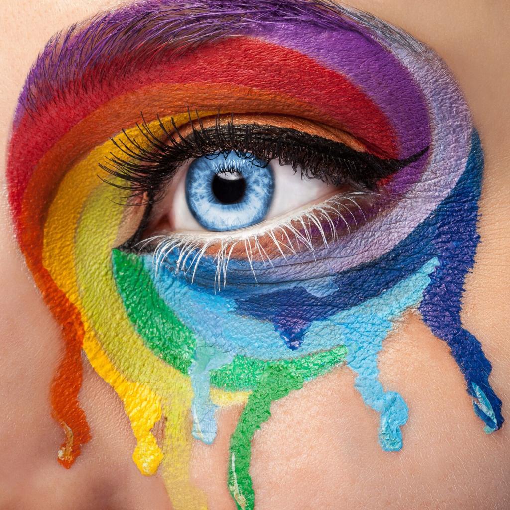
Matte absorbs and calms, satin balances wipeability and softness, gloss dramatizes and energizes. The same navy can feel academic or nautical depending on sheen and texture. Post a photo of your finish tests, and ask for crowd wisdom before committing.
Stories from Real Homes
A freelancer struggling with distractions tried a single teal sidewall aligned with the desk. The cooler, saturated note increased perceived depth and focus. After two weeks, deadlines improved. Share your workstation color move, and we’ll cheer you on.
Stories from Real Homes
A restless rental felt flighty until terracotta planters and a clay-toned rug anchored it. Warm earth hues grounded conversations and reduced furniture shuffling. Try a terra table lamp base, then message our feed about how your room’s energy settled.
Wellbeing, Biophilia, and Color
Gentle sage near plants signals safety and rest. A reader carved a reading corner with a sage throw, linen shade, and one fern; their evening breathing practice stuck. Try a plant-toned accent, then comment with your new ritual’s time and place.

Wellbeing, Biophilia, and Color
Red can accelerate action when applied intentionally—a tray, a clock hand, or book spine. Too much jars. One athlete added a scarlet stripe to a gym wall and felt energized, not wired. What’s your smallest red move this month?
Micro-Experiments and Community
One-Week Accent Challenge
Pick one accent color aligned to a desired feeling, apply it in two removable ways, and journal daily mood shifts. Post results in our thread Friday. We’ll highlight the most insightful observations and propose next-step palette tweaks.
Subscriber Palette Exchange
Swap three favorite swatches with another subscriber who shares your room type but different light. Compare experiences and co-design a tiny intervention. Sign up below, and invite a friend who is color-curious but hesitant to start.
Before and After: Your Story
Document a micro-change—new pillow covers, painted bookshelf backs, or colored lampshades—and narrate the emotional shift. Color psychology is nothing without lived stories. Send photos, tag your city, and we’ll feature regional roundups that inspire neighbors.
